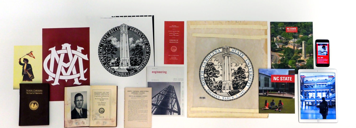
The NC State Brand as you know it traces back to a refresh in 2014, where our visual identity, mantra and editorial tone came to life. This summer marks a cumulative update to that brand with some significant updates.
Much of the usage of the brand is handled by Marketing and Communications staff throughout Engineering, but there are some elements that I want to ensure is on everyone’s radar. When in doubt, shoot me an email and I’ll be happy to provide guidance or get answers.
Highlights
- Font – NC State’s new font is the open-source Roboto. This replaces Univers and Glypha typefaces. Google’s Roboto is conveniently based on Univers, so you won’t really notice much visual difference, however this means that you can easily access Roboto in everything from Google Docs to PowerPoint to Adobe software. You can also use Arial when needed, but given Roboto’s openness, I’d encourage using that whenever possible.
- Design Style – no gradients, no translucents, no drop shadow and instead heavy use of brand colors and tints. Rounded corners are back, as is texture.
- Logo(s) – There’s now white version of the brick. The requirements for spacing around the brick logo have also changed and relaxed a tad. Within limitations, we can also now have graphical identities for events and initiatives, so that will relax some of the restrictions we’ve been required to enforce. Hooray.
- NC State Marks – the list of graphics that we can’t use has expanded, to include Tuffy, the Block S, and the Hallmark (in addition to a variety of other seals and marks used historically).
- Circle Wolf – you probably recognize the Circle Wolf from the previous Think and Do the Extraordinary capital fundraising campaign. It has made a comeback, and is now available as a general purpose graphic element. It is not currently a replacement for the use of the official NC State logo (the Brick).
Important Reminders
- Under no circumstances should you use “NCSU” (except in the literal ncsu.edu web address). It is always NC State University, NC State or North Carolina State University.
- You still cannot make up a logo for university business – consult with your MarComm team if you need a visual identity for something.
- Editorial style hasn’t significantly changed, including a) we don’t use “Dr.” in front of someone’s name in a sentence (instead, “Derek Ham, assistant professor of graphic design”); b) no ampersands; c) no oxford commas
- Registered Student Orgs can have their own visual identities, but should not suggest they are representative of the university. Instead, should phrase their association (e.g.: Student Chapter or “at NC State”). However, if they support or are closely tied to the department, they must follow the core brand and use the NC State brick logo (and must comply with all the associated rules).
- Trademarks – all of these things are registered trademarks, and the university has the responsibility to protect and enforce the brand, and this is governed by policies, regs and rules (RUL 01.25.01). Our Trademark Licensing department will yell at your friendly local communicator when there are violations of the brand, and we will then have to help enforce. When in doubt, please ask us what is appropriate so we don’t get yelled at on your behalf.
The Brand Narrative
“Since 1887, NC State University has served to inspire and empower people in their pursuit of excellence.
From our home in Raleigh, North Carolina, we dream big to produce a wealth of ideas and unlock new possibilities. We connect people with peers and mentors who can support and amplify their passions. We get results — in experiential education, research, partnership and economic development. And we reach out, ensuring that the work we do here prepares communities everywhere for success.
NC State is not and will never be an ivory tower. We are a living, learning Wolfpack, hundreds of thousands strong, always on the hunt for new knowledge and lasting solutions.
Together, we Think and Do.”
